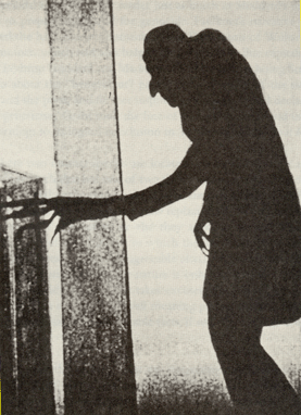
Following my recent posts on German expressionism and its influence on film noir, I came across something interesting. While recognising that the expressionist classics of the early 1920s had more than a chiaroscuro look to define their imagery, this characteristic is cited as the most relevant connection with Hollywood noir of the 40s and 50s.
Before the mid-1920s film stock was ‘colour-blind’ as it did not absorb the tones between light and dark, so the processed images had very stark contrast. It was not until 1924-25, with the appearance of first Orthochrome and then the superior Panchromatic films, that the processed film could render a broad spectrum of grey tones.
This begs the question: was German expressionist chiaroscuro more a result of technical limitation than a creative initiative?


All media is limited by the existing technology – it’s what they did with the tools they had to them which made it impressive, how they used those limited palettes and created evocative imagery that still appears and is referenced today. 🙂
LikeLike
Fair comment Igno and thanks.
LikeLike
Great work, lovely the insight. great images.
LikeLike
IT was Orthochromatic film that was in use before the intorduction of Panchromatic in the mid 20s. Ortho was blined to blue. Other than that its gray range was limited to all colors but blue. This is why skys all looked white. The lack of ray range as described may not have been the fault of the orignal film or its limited range, but the results of viewing duped prints several generations removed where contrast increased with each reprinting and duping negatives from prints and duped prints.
LikeLike